OKA UI - UI design system and Svelte UI Components Library built for Vietnamese people.
OKA UI design system was made in creation of the OKA UI Svelte component library built for the Appta software platform, offering a collection of customizable, accessible, and themeable components.
TIMELINE
Aug 2025 - Dec 2025
ROLE
Design Engineer
- Official docs site: https://oka-ui-sv.vercel.app/
- npm page: https://www.npmjs.com/package/@okaapp/oka-ui-sv/
- Demo page: https://oka-ui-sv.vercel.app/demo-pages/
Why OKA UI Exists
In the current modern era of technology and web development, where every product looks the same, OKA team envisioned a new look for the web that remains modern standards while still being able to bring users back to the good old days with dynamic theming system (not just light and dark).
OKA UI was designed with these values in mind:
- Easy on the eye for long daily usage (hours, not minutes)
- Built to support the UI of valuable tools
- UI with personalities
- Communicative with relevant feedback on every interaction
- Simple, optimal DX (Developer Experience)
Visual Language — Natural & Communicative
The visual goal of Oka UI is flat yet tactile:
- Avoiding the over-processed look of Material Design
- Warmer and more human than traditional flat UI
Tactile Feedback
Interactive elements follow a physicality principle.
- Buttons subtly scale to 98% on press
- Feedback mimics physical resistance, not just color change
This makes interactions feel intentional rather than decorative.
Soft Geometry
- 12px border radius across interactive components
- Friendly silhouettes that contrast with sharp, enterprise-heavy UI
Hierarchical Spacing
- Strict 4px baseline grid (4, 8, 12, 16…)
- “Spacious by default” rule
- 12-column desktop grid with 24px gutters
Dense dashboards remain readable without visual noise.
The Main Challenge: Designing a dynamic theming system
Our UI system needs to be able to offer a wide range of theme selection that once selected, brings a whole new atmosphere to the UI, that means color changes would happen everywhere, not just on the "brand" color like most other systems out there do, while still maintaining high performance and small package size.
Utilities Token Layer
We approach this problem by designing a utilities tokens (variables) set that should be the sole source of reference and application for all components and UI elements (including SVG paths). And then for each of these utilities token, a color value would be given based on which theme is applied. With this utility-theme mapping, we were able to flexibly apply a whole new set of colors based on theme changes.
At the :root level of CSS we have a default theme that also act as a fallback for any unlikely failure.
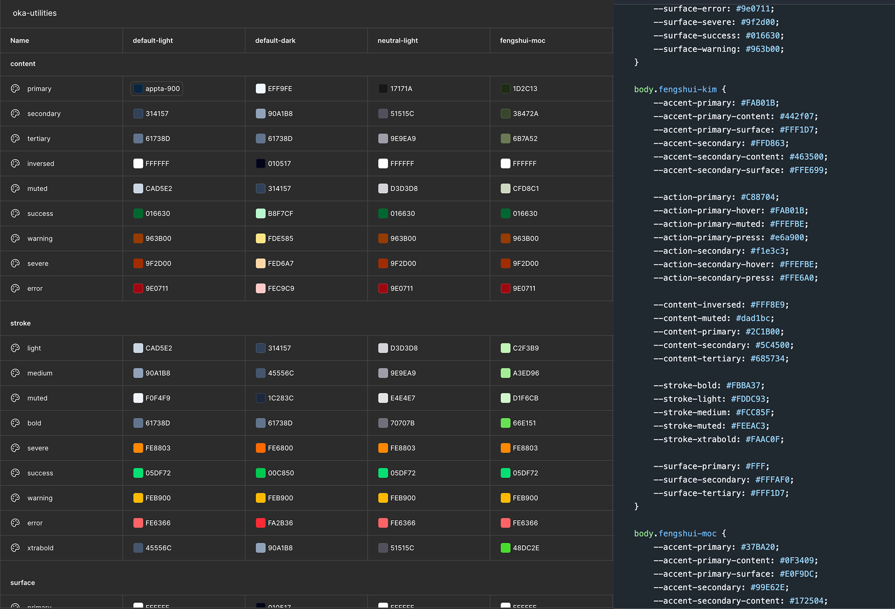
Variables Naming Convention
Naming convention for css variables/design tokens has always been a huge headache and pain points for both creators and users alike. This is a huge communication issue that if not well-resolved, could render the system unusable in the future. Understanding this, we put many hours into discussion.
We decided to prioritize human-readability and simplicity, believing this would be the most communicative for both designers and developers alike.
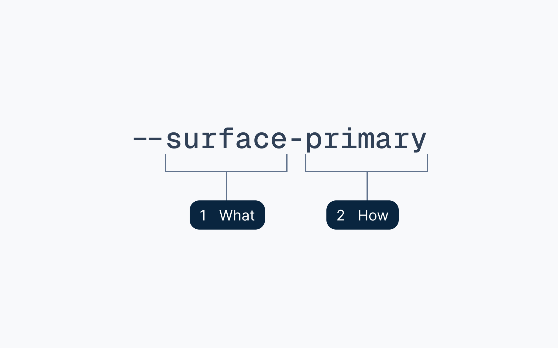
The convention consists of only 2 parts:
- What should this be used for: content, surface, stroke, actions...
- How should this be used: tells hierarchy, boldness and target
Theme Sets
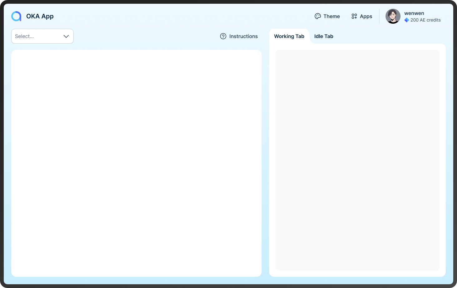
We currently offers 11 themes in total, with a <ThemeSwitcher/> components provided for switching between themes.
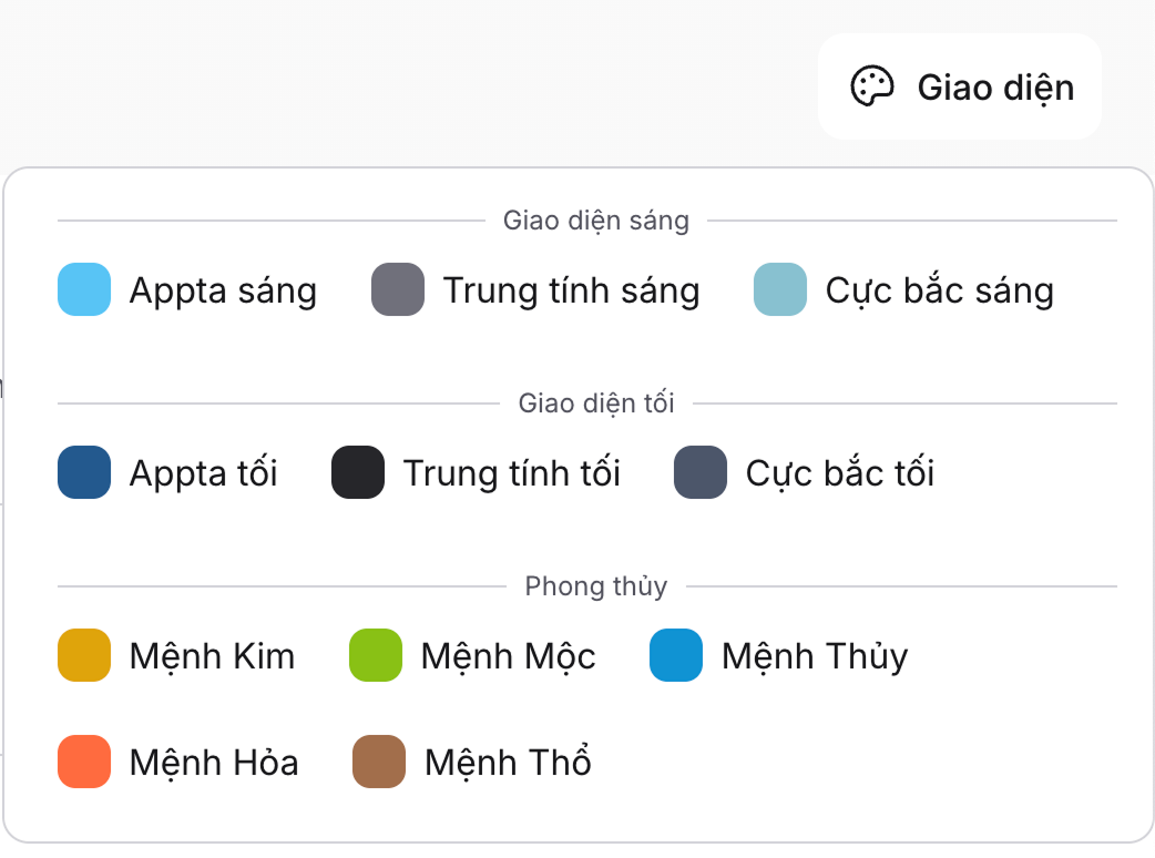
Themes are grouped into different families for better visual hierarchy and selections. Each themes are defined with a set of json meta data and a css variables set. We plan to extend the themes sets even further in the future, going straight into the 2x.
The “Feng Shui” Theme Set
- Kim (Metal): Gold / Yellow
#FAB01B→ prosperity - Moc (Wood): Green
#37BA20→ growth & harmony - Thuy (Water): Deep Blue
#118BD1→ fluidity - Hoa (Fire): Red
#E04638→ energy & action - Tho (Earth): Brown
#96624A→ stability
Nord: Low contrast easiness for the eyes.
- Nord Light: Arctic-inspired theme (author's personal favorite)
- Nord Dark: Cozy dark theme based on the Nord color palette
Neutral: High contrast simplicity.
- Neutral Light
- Neutral Dark
Default UI.
- Default Light: The default/fallback/primary UI with aquamarine/indigo branding colors theme.
- Neutral Dark: The dark mode offering of the default UI with dark navy atmosphere.
Typography & Readability
Typography is designed for clarity first, expression second.
- Inter — primary UI text.
- DM Serif Display — decorative headers for information-focused use cases.
Inter is chosen as the main typeface as we aim for readability and long daily usage.
Variable Fonts
Variable font usage allows subtle weight shifts for hover and active states without layout shifts.
Accessibility as a Design Constraint
Accessibility is embedded into the token architecture, not layered on afterward.
Contrast Enforcement
Semantic guarantees ensure combinations like:
--content-inversed--action-primary
remain WCAG-compliant, regardless of theme.
Visible, Not Loud
While the system uses ARIA labels and headless state management (via bits-ui), the visual layer ensures accessibility is felt:
- Clearly visible focus states
- A highlight ring focus technique, utilizing the bright accent colors with a bold outer animated ring to attract attention.
Focus remains visible on any background without visual clutter.
Explore Oka UI in Practice
A design system only makes sense when experienced directly.
Documentation
The docs focus on mental models and system architecture, not just APIs.
→ https://oka-ui-sv.vercel.app/docs
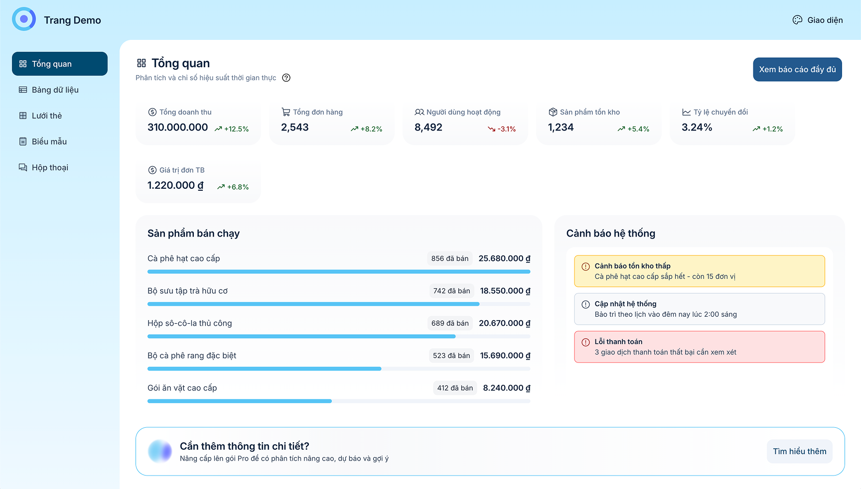
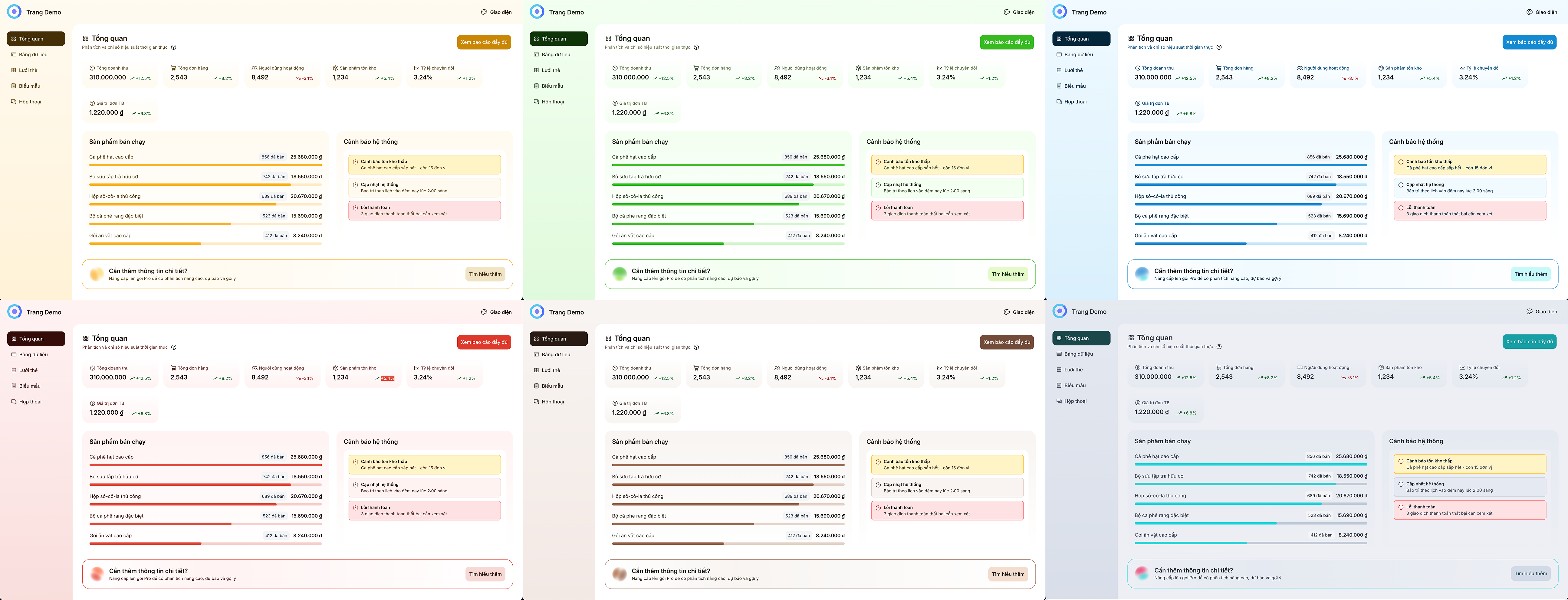
Live Demo Pages
Realistic, data-heavy dashboards designed to stress-test theming, spacing, and readability.
→ https://oka-ui-sv.vercel.app/demo-pages