Spreading the good news across the organization
TIMELINE
May 2024 – Jun 2024
ROLE
Product Designer && Business Analyst
The Situation
A business unit inside a large tech conglomerate was struggling to share its quarterly achievements, operational events, and upcoming initiatives with engineering teams spread across multiple divisions. Existing newsletter formats were long articles that few engineers read, and there was no unified channel for celebrating wins or surfacing important metrics.
The Problem
- Engineers rarely read long-form newsletters, so key updates went unnoticed
- Content creation was ad hoc, leading to inconsistent formatting and missing sections
- Stakeholders needed automated notifications via email and messaging apps
- Misinformation of team statistics and achievements led to confusion and frustration
The Vision
A dynamic, metrics-first newsletter platform where engineers can see top-of-quarter highlights, performance graphs, and testimonials at a glance, then drill into templated content blocks for deeper context. Automated email and message notifications ensure everyone stays informed.
Designing the Experience
1. Translating Requirements into User Stories
I ran collaborative sessions with client stakeholders to capture requirements and convert them into prefixed user stories for cross-team tracking, for example:
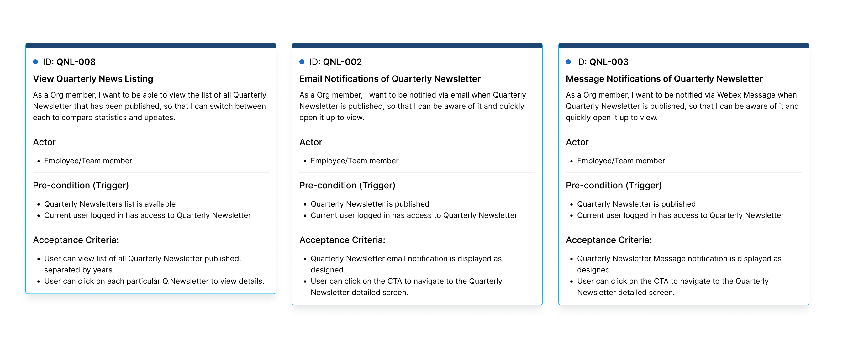
This structure made it easy to prioritize and manage across design, engineering, and content teams.
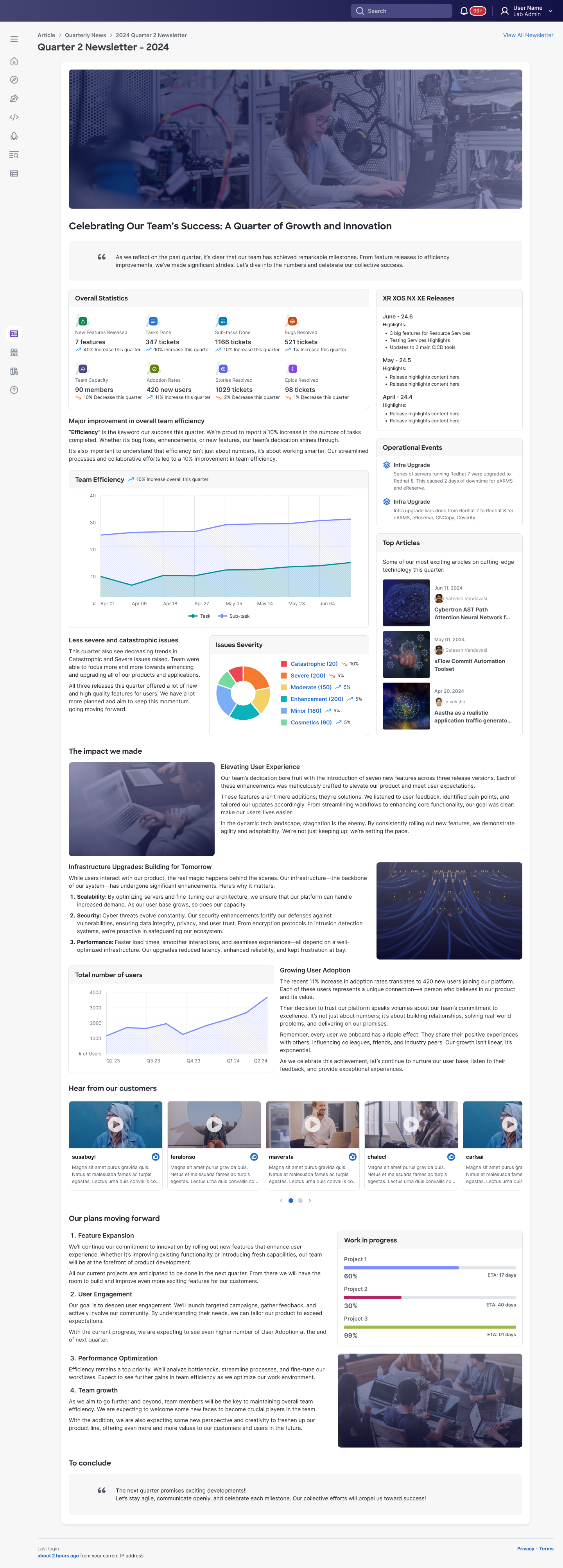
2. Audience-Centered Layout
Since all readers are engineers, I placed an automated data gathered metrics, statistics and graphs first showing:
- Key productivity metrics
- Operational incidents resolved
- Uptime metrics and SLAs
Below the metrics, I provided flexible content blocks with predefined templates for any extra content the author wanted to add such as:
- Release notes
- Upcoming initiatives
- Team shout-outs
- Customer testimonials
3. Prototyping & Feedback Cycles
- Built high-fidelity mocks in Figma with live data placeholders
- Tested with 10 engineers to validate that stats-first layout captured attention
- Iterated on notification wording and template designs for clarity
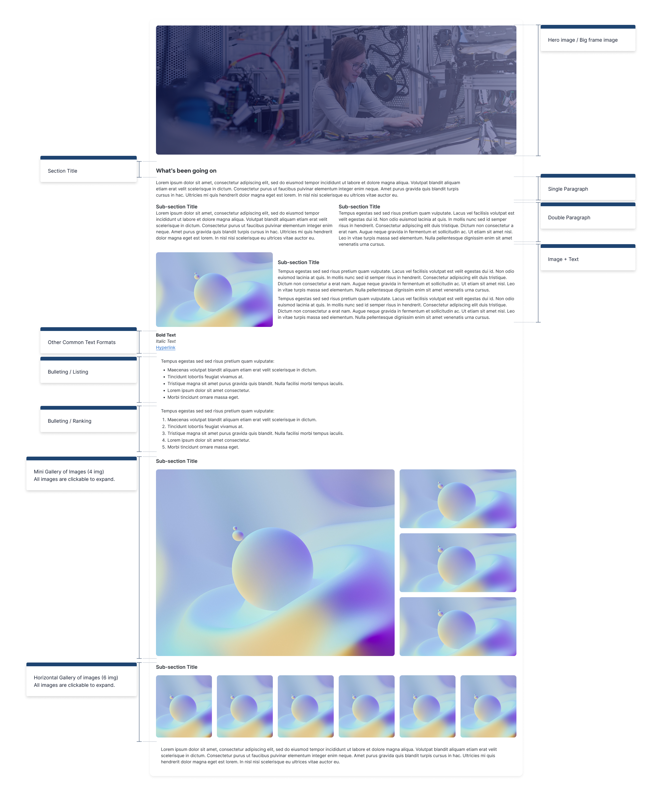
Final UI Flows & Screen Placeholders
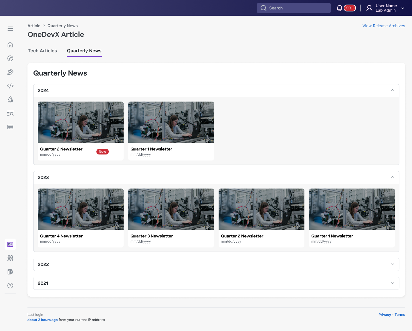
A. Quarterly Listing
Grouped and sorted by year and quarter
B. Newsletter Detail Screen
- Metrics and graphs at top with interactive charts
- Templated content sections for release notes, initiatives, testimonials
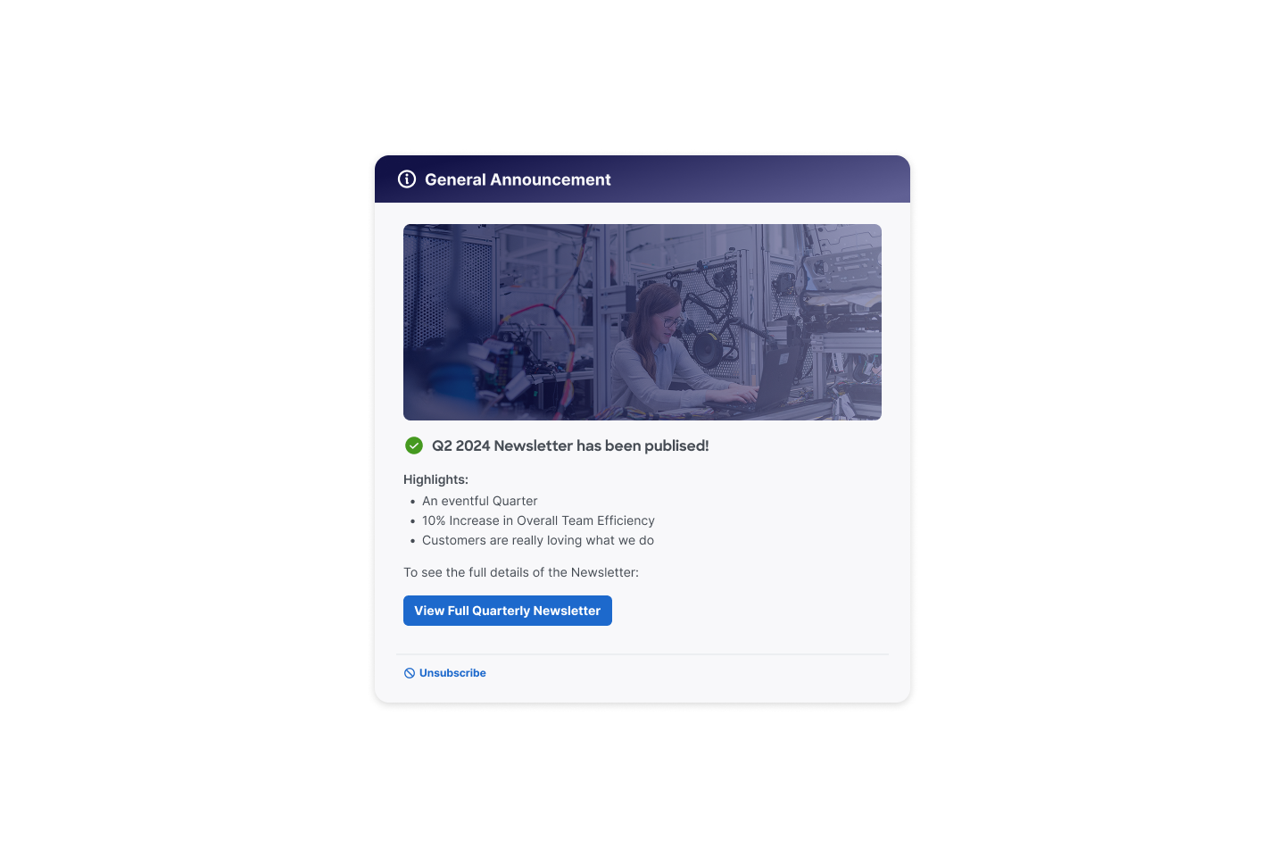
C. Email & Message Notification Templates
- Short summary and highlights
- Call to action to view full content
D. Content Authoring Template
- Predefined sections for each content type
- All images are lightly tinted with a layer of brand color to ensure consistency across the newsletter and the entire UI in general.
Results & Outcomes
After launch:
- 92% email open rate in first release
- 80% click-through rate to newsletter detail pages
- Content authors reported a 50% reduction in time spent preparing each issue
“Numbers really made things interesting for everyone.”
—Content Operations Manager